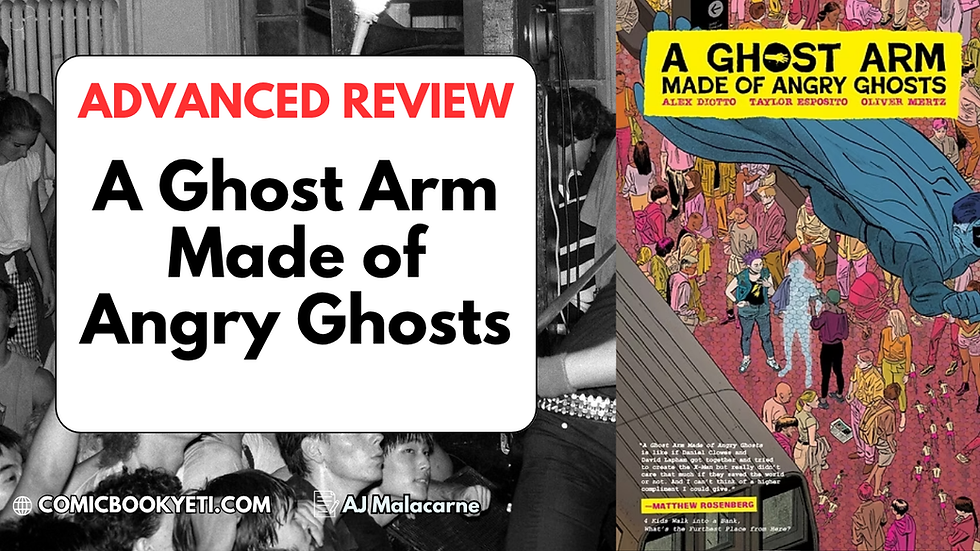
SHOW'S END, ISSUE #1
- Scumchimp, Esquire
- Nov 22, 2019
- 8 min read
Writer: Anthony Cleveland
Illustrator: Jef Sadzinski
Publisher: Mad Cave Studios, Inc

WHAT IS IT?
Fleeing to a carnival in early twentieth-century Georgia, a runaway's dark secret is laid bare as rural tensions erupt into violence in the first part of a five-issue story.
The carnival of Show's End is of the pop-cultural osmosis variety, the kind you see in the like of The Funhouse and William Clark Green's Ringling Road video. If that's your bag, or if you're the kind who roots for the monster, then dive in.
WHAT’S IT ABOUT?
(Minor Spoilers)
Deep out past the outskirts of urbanity in Levington, Georgia – Levington with a "V", not Lexington as you may think – a chicken-fried dirt-farmer of an answer to King Midas keeps his minotaur-child locked in a wrought-iron cage beneath his weathered house. One malignly poised man in a suit strikes a deal to buy the creature. It escapes the next day.
Months later, a child on the run from a shotgun wielding old-timer escapes into a carnival, while locals tell of a livestock-slaughtering monster stalking the woods in moonlight.
Such is the fairytale beginning to an already corpse-strewn tale, come the close of Show's End #1.
WHAT WORKS?
As a limited-issue run, the work paces itself at a swift march. The scenario, relationships, and people of this story are punched-in one-by-one in turn with no room for nuance outside of some self-aware commentary. It's heavily archetypal, and everyone fits into distinct genre categories. The straightforward nature of the thing, and the fact that the drawings, color work, and lettering all reinforce this direct strategy has me inclined to interpret the archetypes as a deliberate style choice, which I'm inclined to accept on good faith. The archetypal nature of the work as a whole means that the narrative signposts clearly. If you like the first issue, you'll probably like the next four.
This is the kind of story where star travelling-carnival performers can be seen doing all the manual labor instead of operators and roustabouts. So far, it's a fable, which isn't a bad thing.
The lettering is readable, with no flourishes until the speech balloon borders waver and howling words erupt through their borders.
The digital color strategy is to serve the page exclusively. It keeps the bloom-use restrained, and never muffles the inks. It directs the eye. When it's night-time, the color palette is cool. When everything's fine, the palette is warm. When something traumatic or suddenly violent happens, everything gets red.
The draftsmanship style falls slightly on the cartoonish end of the spectrum, particularly with distant figures. Cues hold over from reality, and the artist only implements abstraction to serve individual story moments. With one exception of a fine page featuring a locked-chest cutaway, the art is generally best with foreground figures cast in a strong perspective with direct lighting. All of this serves to bolster the (so far) archetypal story and characters.
Panels generally maintain static relationships to each other, focusing on strong moment-to-moment clarity. This proves a success.
A relatively large handful of characters are introduced for a first issue, very briefly touched upon, and are still immediately distinguishable.
The cover of Issue #2, included at the end of the digital copy reviewed, sets up the next turn in the narrative overtly in a way that catches interest. I look forward to reading it.
The inks, coloring, and lettering all work holistically in the same direction. It's a unified team effort that lays all its cards on the table to good effect.
It has an immediately interesting premise.
The worldbuilding is mostly found in detail and action, without too much overt exposition. When the exposition does show up, it makes its point and leaves. That's wonderful, and indicates respectable discipline.
WHAT DOESN’T WORK?
Violence and death is involved, horror trappings, heavily shopped archetypes, and readers may have issue with the handling of certain characters (see below). It uses horror elements and is violent, but isn't horror itself.
The generalized urban fantasy tone is unfocused, and the story has nothing to do with its compelling placement in 1928 Georgia. Personally, I wish the compelling setting had more of an impact on the carnival scenario than "It's somewhere in the backwoods and there are rednecks." It seems like the aim was to have a pop-culture-derived carnival scenario, and a token place and time was chosen to justify the inclusion of isolated settings, cars, and guns while still being "old-timey". That's a bit of a dashed hope after the first page, and contributes to the fissure between carnival crew and townies boiling down to a shallow 'Greasers-Vs-Socs' relationship. It's like… prejudice, man. Let's Do It For Johnny, man-- let's do it for Johnny! This all comes from the lack of depth, which isn't necessarily a weakness as it comes from the limited series nature of the work, which can allow for the strength of a tightly controlled plot. Around and around we go, everything has its ups and downs. Much depends on #5 being a strong finish, which seems like a good bet so far.
A clearer problem is that marginalized characters + archetypes = a touchy subject, and hoo boy, the comic leans in. The carnival psychic is a dark-skinned woman dressed in huckster fake-traveller garb; not a sticking issue by itself, except she wins the Counsellor Troi Award for showing up, putting her hand to her head and announcing that (paraphrasing for emphasis here) ShE SEnseS tHaT ThE gIRl SpeAkS trUE, and immediately bumbling her way back out of the limelight. The crew's resident (read: "possibly only") black man is a tall and friendly person keeping a special bond with the carnival's star performer, a young disabled child. He casually announces (in close-up) the dire consequences if a-a-a-a-nything should happen to his vulnerable ward… and so on, etc. I know this song and dance. You know it. You know what happens, we both know what's gonna happen, this is either a dealbreaker for you, or it ain't.
The tone is nebulous. All the madcap escalation, sprinkles of profanity, gollygee-willickers dialogue and sudden stylized violence suggest morbid humor, but barring two overt gags the actual content veers exclusively between pathos and intensity. This may be due to the establishing needs of a first issue – I wouldn't be surprised to see this adjusted in #2.
A small number of panels didn't get as much love as the others.

WHY SHOULD I READ IT?
Honest analysis often is less about "right and wrong," and more about whether creative efforts broadcast and serve an overall goal. Everything works here, and any lack of subtlety means that if you like the first issue, I'm confident you'll like the next four.
Show's End is shaping up to be a fast-paced monster story tearing through desolate country, and it heroically refuses to waste your time.
Fans of sympathetic monster narratives, carnival intrigue, and Country Gothic will find themselves right at home here. While it's too early to say definitely, the overall concept appears as though it will follow the monster avoiding a (presumably) villainous figure in pursuit once the initial conflict is resolved.
WHAT SHOULD I READ NEXT?
If you like the writing:
Silver Skin #0 by Anthony Cleveland & Tanmoy Das
Middlewest by Skottie Young & Jorge Corona
H. G. Wells’ The Island of Dr. Moreau by Ted Adams & Gabriel Rodriguez
If you like the art:
ABOUT THE CREATORS
Anthony Cleveland – Writer
This is someone working their ass off, getting in where they can creatively while working full time to support himself professionally. I'd like to see him get the shot at another limited or regular run.
Music Lover: Seems like a fan of Tom Waits, so shake his hand if you meet him.
You may discover that a screenplay he wrote made it as a finished film. Sadly, he wasn't thrilled with the result. It was interesting to read his thoughts on horror after chewing over my own opinion on Show's End's relationship to its own horror elements. I feel as this comic is a macabre experiment, and that given his druthers his next project would be something more wholly horrific. I would be interested in buying such a thing.
Jeferson Sadzinski – Illustrator
I'm indebted to the Mad Cave creator's spotlight for this information. I took particular interest of his interest in clothing as a part of character building, which is something I saw in his publically available sample work.
Dream Team: It seems as though Sadzinski and Cleveland were both winners of a 'talent search' last year, and that Show's End followed. This delights me.
Outlander: I'm not sure if he would be comfortable with me pointing it out-- apologies if so-- but Sadzinski is a Brazilian artist. Latin America, with Brazil and Argentina in particular, have a strong comics history and its absolutely Goddamned baffling why more comics companies aren't tapping into its accomplished creative workforce more than they are, especially in the internet era. Sadzinski acquitted himself well here, and comics readers as a community need to support this trend in order to get translations and more cool shit. It took how many decades for La Eternauta to get an official English translation? Why?! Large companies are lethargic, fat, and slow on the uptake. It's up to vibrant, lithe, and smaller companies to out-innovate and out-compete. I feel like Show's End, from Colombian/Floridian Mad Cave, is an example of that.
Julian Gonzalez – Colorist
Predominantly known for Mad Cave's Battle Cats, this colorist is strongly influenced by the Euro and Japanese scenes. Big on saturation.
Looks like Gonzalez colors to emphasize movement. As noted earlier, his use of digital bloom and gradation is restrained, implemented to sell direct lighting.
Normally favors texture in other projects, but takes a different tack on Show's End #1. He repeatedly, and subtly, creates spotlights over and over in most scenes. Best observed in the moonlight farmhouse attack, this is a welcome theatrical flair for a carnival-themed comic. Well done.
Justin Birch – Letterer
Multitalented: This letterer has a Bachelor's degree in graphic design, and turns it to full effect in matching his current project.
Was nominated for the Ringo Award, specifically.
Accessibility Oriented: Known for his association with Broken Icon, and a powerful concern for readability over all else.
M. A. Zapata and Andrew S. Zea – Designers
Multitalented: Zapata's personal work has an illustrative hand drawn sensibility, even in digital work. He shows versatility with his assignment here.
Zea is the dedicated graphic designer of the two.
Zea works currently on Midnight Task Force. Zapata is also tasked with MTF, as well as Honor and Curse, Knights of the Golden Son, and Battlecats.
HOW DO I BUY IT?
Click one of these:
The image(s) used in this article are from a comic strip, webcomic or the cover or interior of a comic book. The copyright for this image(s) is likely owned by either the publisher of the comic, the writer(s) and/or artist(s) who produced the comic. It is believed that the use of this image(s) qualifies as fair use under the United States copyright law. The image is used in a limited fashion in an educational manner in order to illustrate the points of the author and not for the purpose of entertainment or substituting the original work. It is believed the use of this image has had no impact on the market value of the original work.
All Mad Cave Studios characters and the distinctive likeness(es) thereof are trademarks of and copyright Mad Cave Studios or their respective owners. ALL RIGHTS RESERVED