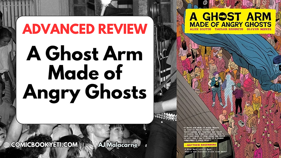
LETTERING: WHAT & WHY
- Byron O'Neal

- Apr 27, 2018
- 4 min read
Updated: Jun 24, 2021
Here’s the thing about comics right now: The writer gets most of the accolades for a good comic. Then comes the artist. After that? You don’t often see the colorist, the letterer or anyone else getting a lot of attention.
“You know the word balloons and sound effects? That’s me, baby.”
– Clayton Cowles, Letterer
But that’s changing. Little by little, you can see books like The Wicked + The Divine adding the colorist and letterer’s names to their covers. Why? Because they’re important.

What is Lettering?
In a recent AMA on Reddit’s “/r/comicbooks” subreddit, Clayton Cowles summed up a letterer’s job as “You know the word balloons and sound effects? That’s me, baby.” While at the base level, that may be true, Cowles (pronounced “Coals”) knows lettering’s much more than that. As one of the busiest letterers in the business, and he spoke against the common misconception that anyone can letter a comic. “As simple as it looks within the finished book, the craft of lettering requires both a good sense of design and an instinct for storytelling.”

For most of us, it’s easier to spot a lettering job done poorly than it is when it’s done well. If you see bad lettering, you’ll get taken out of the moment. At first, you may not be able to tell why – maybe you weren’t sure which word balloon to read in which order. Maybe it blocked something important in the panel’s art.

The truth is, lettering is more than just legible, well-ordered balloons. Kurt Busiek has been writing comics for over 25 years. On Twitter, he’s @KurtBusiek, and he talks often about the art of lettering – the good, the bad & the ugly.
On April 8th, Busiek tweeted a thread: BAD LETTERING IS A SIN AGAINST COMICS. In it, he talks about how good lettering can be used to draw a reader’s eye to important art or story details. He describes the comic’s panels as a stage, where lettering and its positioning, style and its use create a tone and pace for the conversation.

Busiek has plenty more threads on lettering in his timeline, if you’d like to know more. One great one shows a comic with only the lettering, but no art, demonstrating how visual tone and sequence are so key to the storytelling as a whole.
Here's an example below of all these tactics being used in one place. Ariana Maher's tweets show a scene from Nancy Drew #2 (written by Kelly Thompson, illustrated by Jenn St-Onge, colored by Triona Farrell, lettered by Ariana Maher and edited by Nate Cosby) with the actual words removed, showing readers how the dialogue bubbles' placement, rhythm and direction of flow sets the pace for the action, highlights key moments and helps guide readers through the page without seeming forced, artificial or like it's getting in the way of important visuals.
Click Maher's tweet here to enlarge the image and get more details:
Out of respect for growing letterers, I won’t show an example of badly done lettering on here, but if you want to see another exercise in lettering, check out The Wicked + The Divine (by Kieron Gillen, Jamie McKelvie, Matt Wilson & Clayton Cowles). Most panels from it that I could grab to show you great lettering would be ridiculous spoilers, so you should probably just read the whole thing. If you’d like to know more about it, check out my review.

See the Difference Lettering Can Make
Recently, letterer Aditya Bidikar held his second #LettererJam on Twitter. Ten different letterers took the script and the art for a page from issue #2 of Flavor, by Image Comics. The creative team on the book is writer, Joseph Keatinge, Wook Jin Clark on art, Tamra Bonvillain doing colors and Ariana Maher as the letterer.
Here's the script and page of art given to each letterer. Click through to see each:


And here's each letterer's different take on how to letter a page. Click through to see all 9:


You'll probably notice several differences throughout, like:
Handwritten dialogue vs. typed
Sound effect color, design and placement
Word balloon shape and placement
Dialogue that's split into multiple balloons vs. lumped into a single one
Word balloons in different panels in order to maximize space
Here's how the actual letterer for Flavor, Ariana Maher, lettered the page when it went to print:

Which do you think is the most effective? What works? What doesn't? Which did you like best and why?
TL;DR
Good Lettering:
Has words spelled correctly
Has word & thought bubbles in the right order
Is easy to read
Doesn’t cover up important art
Doesn’t take you out of the moment
Better Lettering:
Doesn’t create clutter
Creates a tone and pace for the dialogue
Directs the reader to important focal points
Uses comics as a medium to tell a story in a way that other media can’t
Anchors to the panel borders
Adds to the story
Is an art
Some of My Favorite Letterers
Chris Eliopoulos (Savage Dragon, Hawkeye, Runaways)
Clayton Cowles (The Wicked + The Divine, Redlands, Bitch Planet, The Vision)
Rus Wooton (East of West, The Walking Dead, Invincible)
Ariana Maher (Nancy Drew, Flavor, Prism Stalker)
Taylor Esposito (Babyteeth, Fresh Romance, Hot Lunch Special)
Cory Petit (Uncanny X-Force, X-Factor, Wolverine)
Aditya Bidikar (Void Trip, Motor Crush, Black Cloud)
Thomas Mauer (4 Kids Walk Into A Bank, Copperhead, Starship Troopers)
Todd Klein (The Sandman, Batman: Year One, WE3)